
Contextual Bonuses
Introducing intentional content in retailer galleries.
The Ibotta app is a cash back rewards app that gives users real cash back on products and storewide purchases. This project was specifically focused on bonus rewards related to product offers.
The problem
The goal
Funded bonuses have low awareness.
60% of client bonuses are started without an impression and 37% of client bonuses are completed without an impression. This means that those savers may never realize that they have made progress towards or earned extra back due to completing a bonus.
Client-funded bonuses make up ~95% of our bonus content, but account for only 15% of all bonus completions.
We needed to build awareness of relevant bonuses, helping savers find more value with less effort.
My role
As the UX writer, I owned the content design for this project and contributed to the research & testing process.
I collaborated with multiple members of the product team. I worked with the squad product designer, iterating explorations using Figma. I drafted research requirements with the ux researcher and product manager, pushing for increased iconography and term testing.
My hypothesis
If we can introduce client bonuses in the retailer galleries when relevant, we can increase overall bonus visibility and engagement, and therefore increase redemptions.
To successfully inject "contextual bonuses" into the experience of browsing offers, we'd only show in-progress bonus components so we can keep the contents valuable to the saver.
The process
Current state
The most contextual delivery of bonus information came from in-app notifications.
This format had significant drawbacks:
-
Took savers away from current task
-
More copy on top of information over-loaded screens.
-
Messaging did not convey the benefit to saver.

The process
OUTCOME
There are no small roles, only small components.
The final product was packed with strategy, tested well, and doubled the amount of client-funded bonus redemptions within the first month.
The full roll-out added an additional $2 million in additional redemption revenue.
Because we delivered a contextual, value-led design, savers earned more cash for things they already intended to buy.

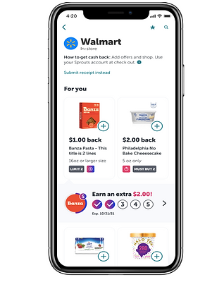
Here's what's happening:
The headline doesn't mention the term "bonus."
-
Lead with the value of extra money.
-
Associates the information in the component with the offer and not a separate task or new thing to learn.
The entire component only contains information relevant to the specific moment in the flow. If you click the carrot - you'll be taken to the bonus details.
-
The exact amount of extra cash you'll earn. No "up to" language here.
-
Clear progress indicator showing steps needed to earn the bonus.
-
When the bonus expires.
We kept the progress ring around the brand circle in effort to build familiarity with this pattern and hopefully reuse this in smaller spaces.
We introduced the $ symbol to build visual association of the "extra earnings" and "bonus" concept.
Explorations & testing
-
In order to respect the native content in the retailer gallery (where this component would live) I leaned into representing more information with visual elements with each iteration.
-
To help build bonus awareness throughout the app, we introduced tags to associate bonuses with offers. This led to further iconography research & testing.
-
The ring around the brand circle was an existing design pattern but didn't always serve as a clear progress indicator.
.png)
Research
The initial research included user interviews and survey. We wanted to know:
-
If savers understood bonuses and how to earn them.
-
What pieces of information were most important to savers.
We learned:
-
Savers don't always understand what the term bonus means, but understood the concept of "extra" earnings.
-
Savers wanted to know how many steps they still had to complete in order to earn the bonus.
-
The amount of extra cash back they would get.
LESSONS LEARNED
Sometimes words aren't enough.
This project challenged me to push back on superficial change to advocate for more effective content and a better user experience.
Since this project, I've noticed this thought process take shape in my design team with other features and am excited to see the innovation that we can deliver.